


In this article, we'll be diving into the world of design, specifically, we'll approach design principles and how you can use them to create visually appealing and functional designs that will blow your users' minds, or at the very least, improve your design works!
Let's start
So what exactly are design principles, you ask? Well, they're like the spices in a recipe - they work together to enhance the overall flavor and make the dish (or design) more enjoyable.
Why are these important, you wonder?
Visual Design's aim is to bring clarity to the information while communicating with the user, allowing him to understand what he's seeing while guiding him through the design until he reaches the goal you expect him to, whether it's buying a product, subscribing to a newsletter, etc.
This is where Design comes into play, and why Design Principles have such big importance. Some call it UI, but whatever the name is, the background is just one: Design Principles.
From layout to balance, these principles can be applied to any design project, whether it's a website, a flyer, or even a poster for your local bake sale.
So let's jump in.
Layout
As the foundation for any design project, it's important to get this right.
A well-designed layout is crucial for any design project, including websites, as it will allow you to arrange all the visual elements, such as text, images, and shapes, in a way that makes sense to your users, is clear, and creates visual points of interest. This is where you'll get the consistency throughout your work.
When creating layouts, use Grids and experiment several options, whether you're building for the web or not. Also, consider the user experience and make sure the design is responsive, meaning it should adjust to different screen sizes and orientations.

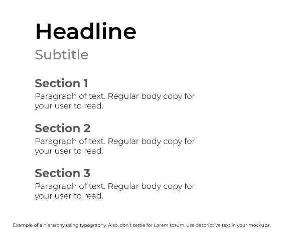
Hierarchy
Or visual hierarchy, is all about organizing content by order of importance and catching the viewer's attention. Using typography, color, texture, and shapes are great ways to lead users through the page while giving them visual cues on how to proceed, how to read what's important first, or what you want them to read/see.
One way to achieve a strong visual hierarchy is by using "The Gestalt Principles", which describe how humans perceive visuals in connection with different objects and environments.
From Wikipedia:
“Gestalt psychologists emphasized that organisms perceive entire patterns or configurations, not merely individual components. The view is sometimes summarized using the adage, "the whole is more than the sum of its parts." Gestalt principles, proximity, similarity, figure-ground, continuity, closure, and connection, describe how humans perceive visuals in connection with different objects and environments.”
Repetition
Our brains love patterns, symmetry, and balance, so repetition is a great way to establish these elements and make it easier for your users to understand the function of those elements. Repetition also creates consistency and rules within your designs, allowing you to break them when you want to draw attention to a specific element.
Establishing a consistent visual language, such as using the same font, color palette, or iconography throughout your design, will allow your users to be familiarised with your patterns and layouts.

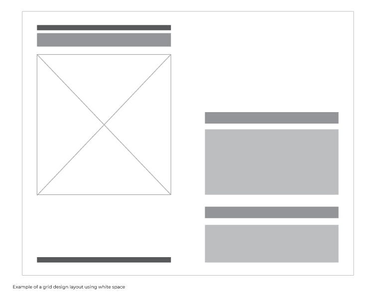
Space
White space, or negative space. This is all about giving your design room to breathe and creating a visually appealing experience. When designing, it's important to remove all unnecessary elements, then space them out while creating balance.
Don't be afraid to leave empty space, especially if it helps you achieve the visual hierarchy and balance you're aiming for. Don't clutter elements and content in your designs, to avoid users running away from your work.
Remember, "less is more"!
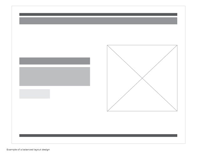
Balance
I mentioned it above, as balance is the distribution of all elements in a specific design along an imaginary center line. By considering the visual weight and direction of each element, you can create a sense of symmetry and stability that will be pleasing to your users' eyes.
Use size, color, shape, and texture to adjust the weight of each element, and pay attention to the direction in which they're pointing to create a sense of movement and flow.
Experiment, test, and have fun!
So there you have it! By applying these design principles, you'll be well on your way to creating designs that not only look great but also function well.
Remember to experiment, have fun, and let your creativity shine!